
A More Perfect Union
There are times in life where the anger, fear, and chaos of what’s happening makes you freeze – you simply don’t know how to proceed or show up in the world. I had been talking to a few friends about creating pieces around the theme of gardens and “Growing Hope.” But we had trouble moving forward. We were not feeling hopeful. We collectively decided that it was OK to make angry art.
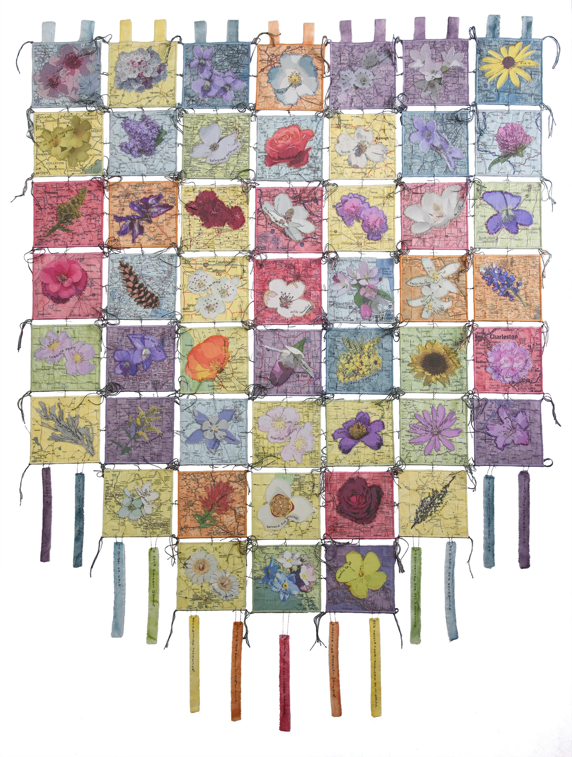
While these thoughts were being discussed, a call for the Sanchez Art Center 50/50 Show came up. The selected artists make 50 six-inch square pieces in 50 days. The idea that came to me was to make 50 state maps overlaid with each state’s official flower and small messages embroidered that would be very pointed condemnations of each state. The judges were correct to turn down my proposal as it really wasn’t fully formed, but I knew that I had to develop this idea and bring it to fruition.
News items were coming fast and furious and they began to form questions in my mind. Healthcare was being dismantled – What states were the least protective of their population’s health? National parks were in jeopardy – Which states made their public lands a priority? Children had been abused – Which states had the worst incidents of human trafficking? I began to make a list of questions that all began with – Which are the 10 worst states for…? My requirements were that the questions were easily researchable, the answers would be per capita, and that they should cover a range of categories. I reached out to friends to help me expand my question list until I had around 65 questions. Some didn’t have easily accessible data, so I dropped them. My final list was 52 questions. Surprisingly, every state showed up on at least one bottom 10 worst list. I need to say that this isn’t meant to be a scientific study, it’s an art piece. I went with what I deemed to be reputable statistical sites with the most recent data available, so I did strive for accuracy. Where two sites differed slightly, I arbitrarily chose one. I gathered the data in spring of 2025. For those of you interested, here is my final list. If you’re not, skip ahead!
Environment
- Highest petroleum consumption
- Least amount of renewable energy produced
- Most fracking
- Most endangered species
- Most species pushed to extinction
- Least safe drinking water
- Most wildfires
- Worst air quality
- Least amount of public land
- Least percentage of state given to state and national parks
Health
- Lowest life expectancy
- Highest maternal mortality rate
- Worst for women’s healthcare
- Highest rate of chronic respiratory disease/mortality
- Highest rate of diabetes
- Least COVID vaccines given
- Least childhood vaccines given
Quality of life
- Least affordable housing
- Highest rate of food insecurity
- Lowest minimum wage
- Highest poverty rate
- Highest amount of welfare recipients
- Least diverse
- Least cultural diversity
- Worst for women’s equality
- Most people incarcerated
- Most inbred
Freedoms
- Fewest registered voters
- Least representation of native groups
- Most restrictive protesting laws
- Most attempts to pass anti-LGBTQ bills
- Most book bans
Education
- Least funding for public schools
- Worst public school ranking
- Least educated
- Lowest percent with bachelor’s degree
- Highest average student loan debt
Beliefs
- Most organized hate groups
- Most support for Christian Nationalism
Child Welfare
- Most children living in poverty
- Highest rate of infant mortality
- Highest rate of child marriage
- Most children in foster care
- Highest rate of teen pregnancy
Safety
- Most gun sales
- Most gun deaths
- Highest rate of killings by police
- Most human trafficking
- Most dangerous for immigrants
- Highest suicide rate
- Highest drug overdose mortality rate
- Highest rate of domestic violence
Based on this list and the number of times each state showed up among the 10 worst for each question, I assigned colors to each of the maps. If the state showed up 23 or more times, the map would be red, 16-22 times orange, 11-15 times yellow, 9-10 times yellow green, 7-8 times green, 5-6 times light blue, 3-4 times dark blue, and 1-2 times purple. I wanted to have a balance of colors, so the parameters were chosen to achieve the most equal distribution of color.
With all that decided, I started dying the fabric. I chose to paint dye because overall it’s very easy to replicate the colors and I could make sure the colors blended. I did have issues with not getting a strong yellow green but decided that it was good enough for what I was shooting for!
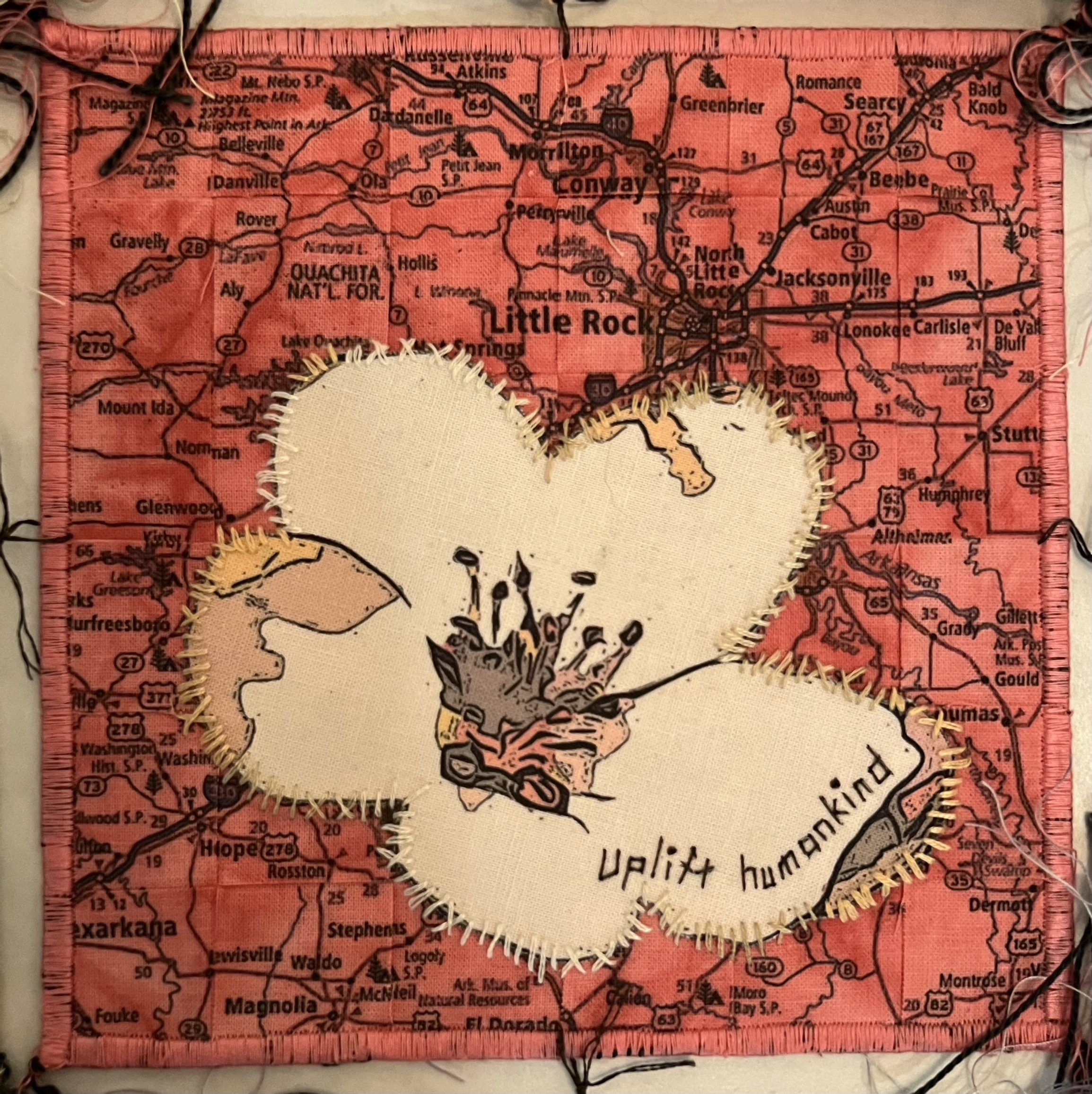
The next task was to find public domain maps, choosing sections of each state map that included the capital and removing the background while leaving the waterways, roads, and cities/towns. I knew that I wanted to have the maps woven which meant printing each map twice.
Following that, I worked with a combination of my photos, my husband’s photos, and public domain photos of the state flowers and then used a photo app to stylize the flower images before printing them. Each flower had to be fused to a piece of white fabric to make it more opaque before being cut out.
The maps were then cut, woven, and loosely fused to a backing fabric. Then the appropriate flower was fused to the map. The flowers were then roughly stitched to the map, and, for a little more visual interest, I threw in occasional Xs to indicate the exact number of categories that state ended up being listed in.
Next came time to stitch in the statements. I started with a list of protest signs but decided to edit the sentiments and make them a little more hopeful, encouraging each state to do better depending on what lists they showed up on. 50 messages now sewn!
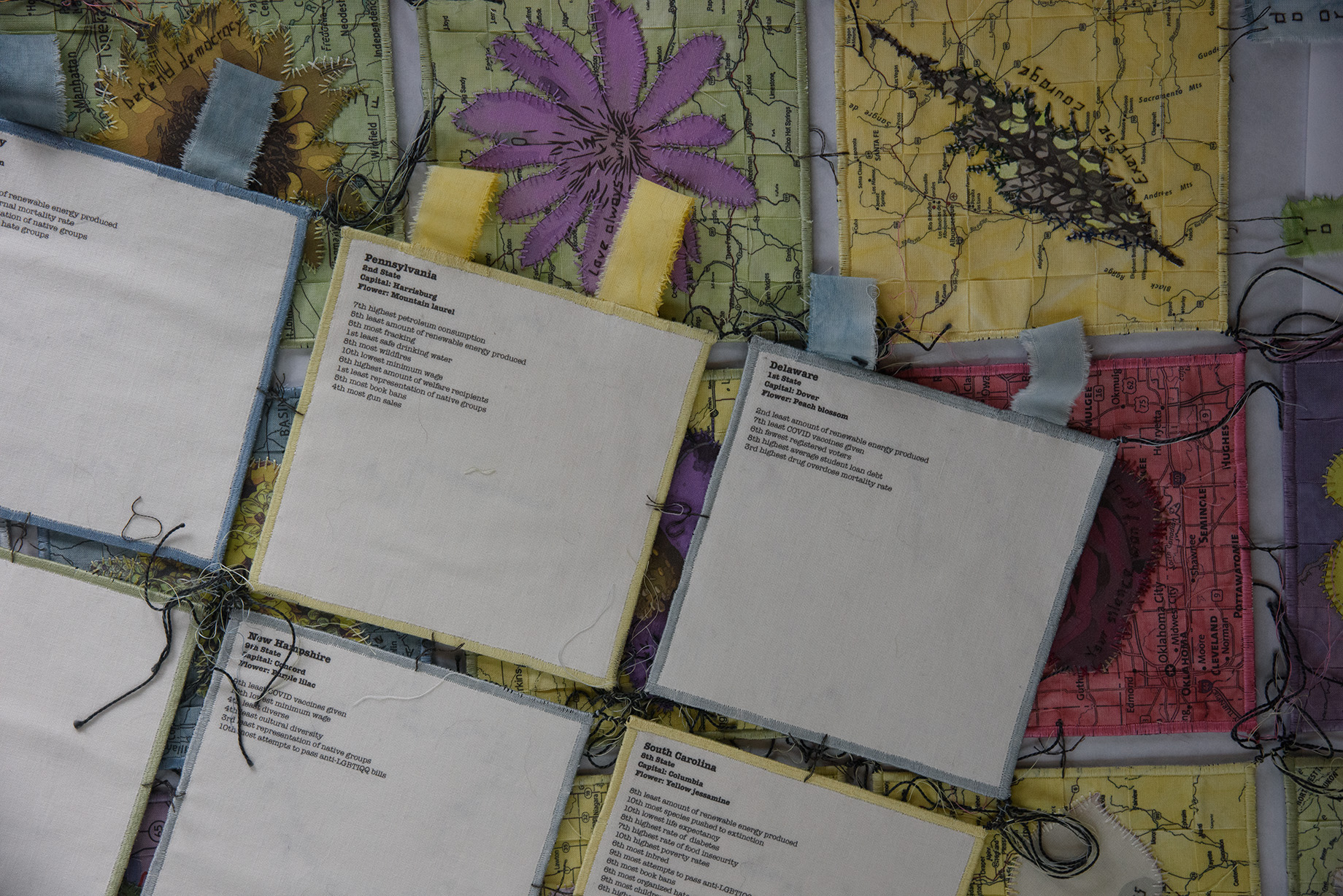
I thought that it would be important to put all the information for each state on the back of each square, so I prepared each state’s information and made the decision at that time to include the order of statehood knowing that this would be the order in which they would be joined in the overall piece. Once printed, the front and backs were cut to the final size, the backs were fused, and the edges were sewn together.
I played with several layout ideas. 50 squares are not easy to deal with especially considering that the piece may need to be shipped and must fold easily. I ultimately settled on this pennant shape and decided to add a rough fringe on the bottom with The Preamble to the U. S. Constitution stitched on.
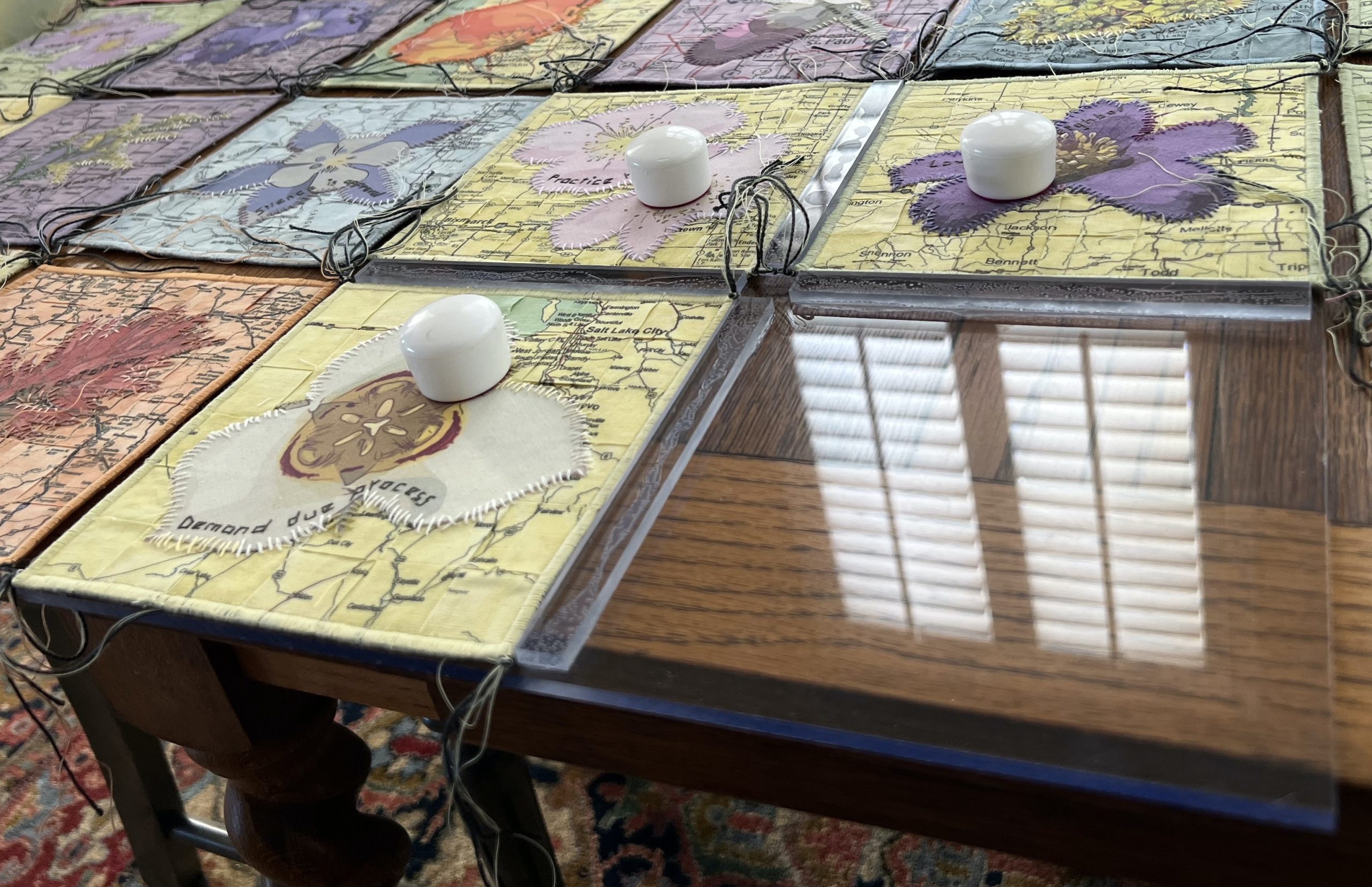
I wanted to connect all the squares by tying them together to roughly show how all the states are truly connected and that actions within each state influence the others. The challenge here was tying all the squares together while maintaining a uniform distance between them. I came up with the concept of creating a quilting jig – something I could lay four squares on where the half inch distance could be achieved consistently. A trip to one of my favorite places was in order – TAP Plastics! They have an amazing scrap section and, once I explained what I was trying to do, the employees found the appropriate pieces for me and cut everything to my specifications. Then, because they are amazing, they gave it to me for free! I went home and glued the pieces together to make the jig. The knots were tied and glue was applied to each knot for extra stability.
I found that the piece needed more support, so I added additional threads, sewing and tying more knots at the midpoint of each square and gluing those knots as well. At this point, I attached the fringe pieces along the bottom.
Originally, I had intended to hang the quilt from thread loops, but it was just too heavy. I had enough of the paint-dyed fabric to make unfinished loops, so I went back to the sewing machine and stitched them on to the quilt. Done!
While I’m completely thrilled with it being done, and it’s something I’m happy with, I can now laugh at the mishaps that happened while creating this piece.
I’ve been printing on fabric for a very long time. It always blindsides me when something unexpected occurs when I prepare the way I always prepare. I prepped the fabric as usual, attached it to one of my go-to stabilizers, and fed the fabric through the printer to print two maps per fabric piece. Approximately 30 of them slipped while printing the bottom section of the second map and blurred the map. Rather than redye the fabric and try again, I decided to wait until the maps were woven and cut down to the correct size first. So glad I did! You would now have to look incredibly hard to find those blurred map sections!
While I was organizing each state’s data for the backs of the squares, I discovered that I had included the same question twice but phrased slightly differently. I had to remove one of the pieces of data but first I had to see what the effect would be on the map colors by test removing each question. I ultimately removed the question that only affected the color of one of the pieces (it was yellow and should now be yellow green). I decided to embrace the mistake and keep it yellow but edge it in yellow green thread.
When I went to print the backs (two states per piece of fabric), the pieces again slipped, only this time they were overprinting on the bottom of each second state. This time, I couldn’t let that pass so I scrapped those I had already printed, treated more fabric, and temporarily adhered all the fabric to cardstock. That did the trick!
Once I tied all the initial knots using the jig, I made the mistake of lifting the piece up only to find that non-slip knots can and do slip. So, I carefully untied those knots and retied them. I didn’t pick it up again until glue had been applied and dried!
I think of this piece as a kind of love letter to each of the states and the United States as well. I hope our country will head towards being more compassionate and I realize that to do this, we need to know what things aren’t going well and what we need to do to improve. I hope this piece begins conversations and helps form ideas on moving forward in caring for our population, our land, and our country.
3 Comments
Permalink
So much thought, research and technical expertise made this a creative masterpiece! Well done Sue Bianchi—let’s hope the nation and populous take notice.
Permalink
What an incredible amount of work. And how worth it the final quilt is. It’s absolutely beautiful!!
Permalink
An excellent way to demonstrate, Sue. You’ve gathered data and made it easily visible. Let’s hope people change their colors. Soon. I hope to see your work in an exhibit.